Turning your illustration into an enamel pin is exciting—but before production begins, your artwork needs to be pin-ready. Skipping small technical checks can lead to lost details, color issues, or disappointing results.
At 366pins.com, we work with enamel pin designers and artists every day. This visual checklist for pin-ready artwork helps you quickly review your design before sending it to production—so your pin comes out exactly as you imagined.
Save this guide. Use it every time. Your future pins will thank you.
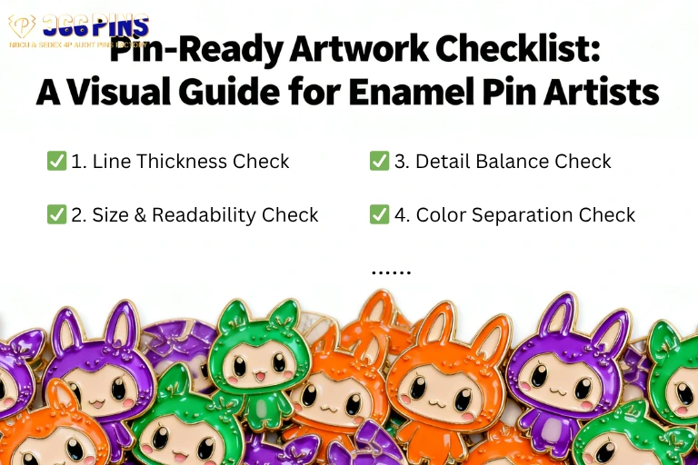
✅ 1. Line Thickness Check
Ask yourself:
- Are all metal lines thick enough to hold enamel?
Pin-ready standard:
- Minimum line thickness: 0.15–0.25 mm
- Outer borders slightly thicker than inner lines
Visual tip:
If you zoom out and lines disappear, they’re probably too thin.
✅ 2. Size & Readability Check
Ask yourself:
- Will this design still read clearly at 1–1.5 inches?
Pin-ready standard:
- Key shapes visible from arm’s length
- No tiny text unless absolutely necessary
Visual tip:
Shrink your design on screen to actual pin size. If details blur, simplify.
✅ 3. Detail Balance Check
Ask yourself:
- Is every detail essential to the story?
Pin-ready standard:
- Strong silhouettes
- Fewer, clearer shapes
- Focus on main subject first
Visual tip:
Cover small details—does the pin still feel complete? If yes, you’re good.
✅ 4. Color Separation Check
Ask yourself:
- Are all color areas clearly separated by metal lines?
Pin-ready standard:
- No color touching without metal borders
- No gradients unless using UV print
Visual tip:
Each enamel color should feel like its own “cell.”
✅ 5. Color Choice & Pantone Check
Ask yourself:
- Have I chosen realistic enamel-friendly colors?
Pin-ready standard:
- Pantone colors preferred
- Avoid ultra-light pastels unless advised
- Expect slight darkening in enamel
Visual tip:
If your design relies heavily on screen glow, adjust expectations.
✅ 6. Soft Enamel or Hard Enamel Decision
Ask yourself:
- Which finish best supports my art style?
Quick guide:
- Soft Enamel: Textured, bold, expressive
- Hard Enamel: Smooth, clean, polished
Visual tip:
Soft enamel works well for illustration-heavy art; hard enamel suits minimal styles.
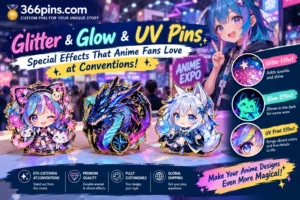
✅ 7. Special Effects Check (Optional)
Ask yourself:
- Do special effects support the concept—or distract from it?
Pin-ready standard:
- 1–2 effects maximum (glitter, glow, UV, transparent enamel)
- Effects highlight key elements only
Visual tip:
If removing the effect weakens the design, it’s a good effect.
✅ 8. Metal Finish Check
Ask yourself:
- Does the metal color enhance contrast and mood?
Common options:
- Gold (warm, classic)
- Silver (clean, neutral)
- Black nickel (moody, modern)
- Antique finishes (vintage feel)
Visual tip:
Test your design in black-and-white—contrast matters more than color.
✅ 9. Border & Edge Check
Ask yourself:
- Does my pin have a clean, intentional outline?
Pin-ready standard:
- Clear outer border
- No floating elements without support
Visual tip:
Strong edges make pins feel premium and durable.
✅ 10. Sample & Revision Mindset Check
Ask yourself:
- Am I open to small refinements after seeing a sample?
Pin-ready mindset:
- Samples protect your art
- Adjustments = improvement, not failure
Visual tip:
Think of the sample as a test print, not the final judgment.
Final Pre-Production Checklist (Quick Scan)
Before sending your artwork:
- ✔ Lines thick enough
- ✔ Details readable at pin size
- ✔ Colors separated clearly
- ✔ Enamel type chosen
- ✔ Metal finish selected
- ✔ Effects used intentionally
- ✔ Ready for sampling
If you can check all of these, your artwork is pin-ready.
How 366pins.com Helps Artists at Every Step
At 366pins.com, we don’t just say “yes” to files—we help artists succeed.
We offer:
- Artist-friendly artwork checks
- Clear, honest feedback
- Production guidance without pressure
- Respect for your creative vision
🎨 If you’re unsure whether your artwork is pin-ready, send it to us—we’ll review it with you.